PUSH Burritos
Push Burritos
Competition: 48HR Repack
School: Georgia State University
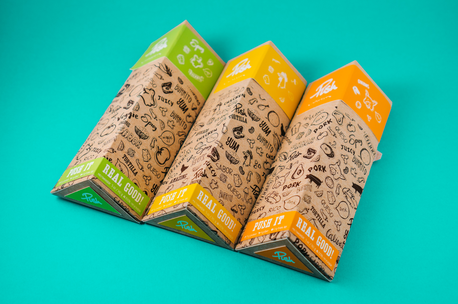
Push Burritos is a 48 hour Repack challenge, where designers developed, conceptualize, and make a packaging design within two days. In a creative team of four, we came up with idea of repackaging frozen burritos, and designed it in a way where it's durable and ergonomic for consumers. We placed in top 10 and was invited to a packaging conference.
Concept +
Branding
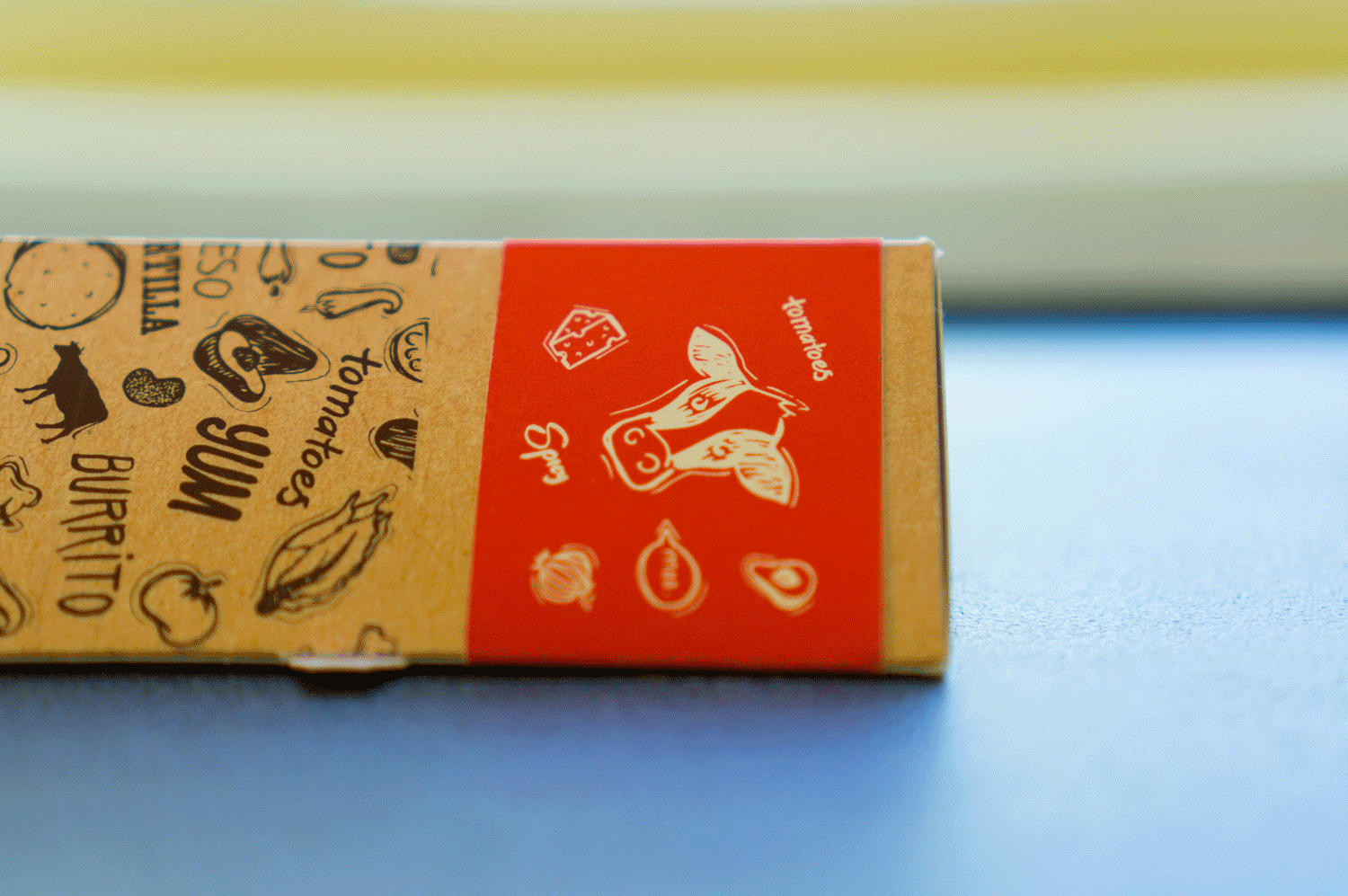
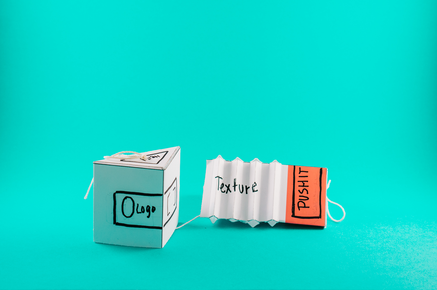
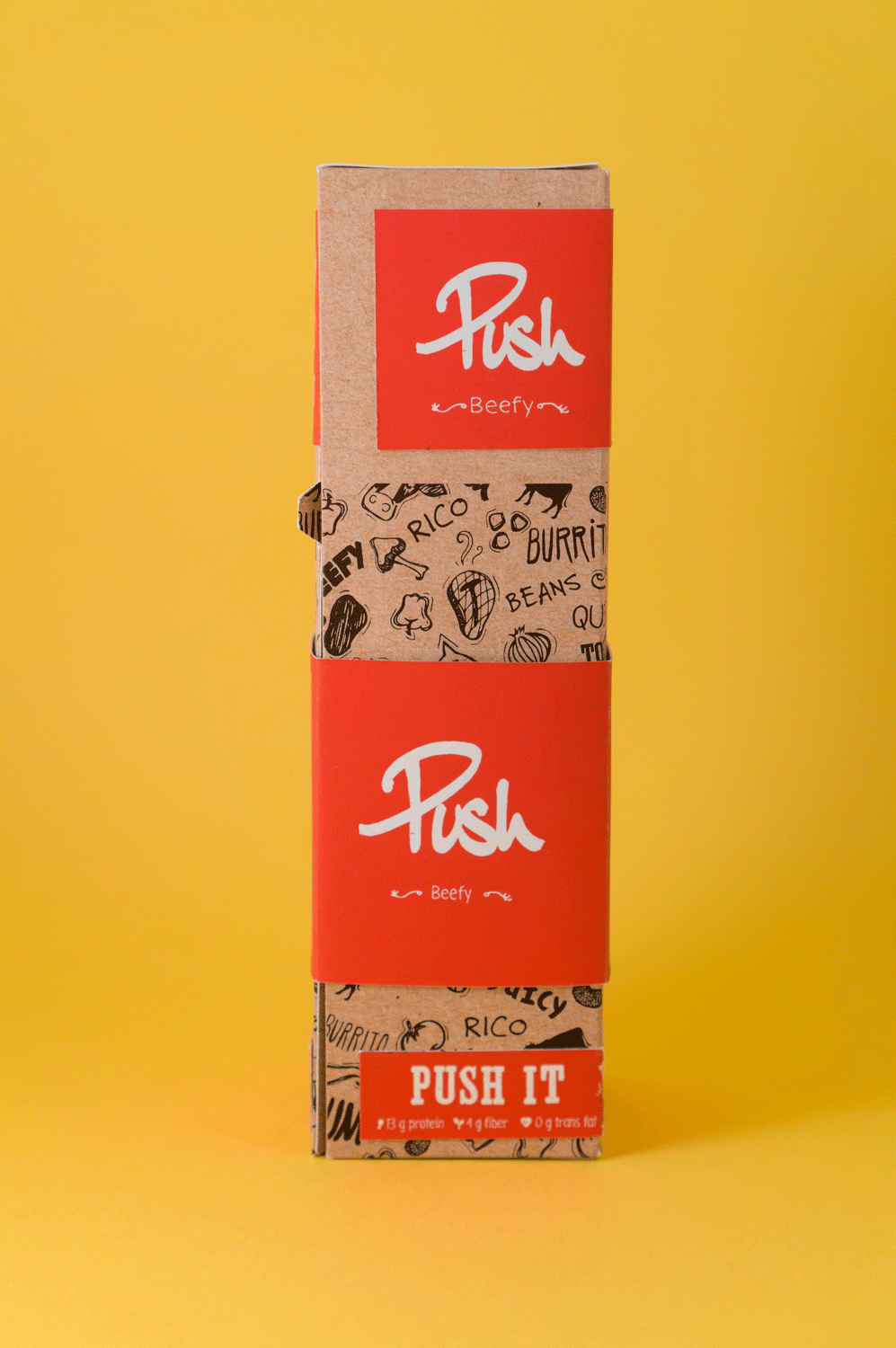
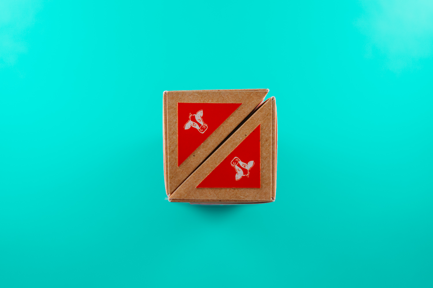
Since it's a frozen burrito, consumers will have to heat it in order for it to be consumable. So one of the ideas was to incorporate a perforation so that it creates ventilation during heating. The top was removable so that it can be use as a lid and save it for later, or it could be use to compressed trash later. We also took into consideration of the overall shape of the package, by incorporating a right-angled triangle, it gives a nice sturdy grip and it allows a packaging of two for optimum shelving solution.
Due to the triangular shape and its a smaller burrito, the brand was minimalized yet by using illustration and a color tone, it helps capture the audience's attention and gave a really nice push of colors. We also use four colors to help identify the different flavors such as red for beef.